
SPRING 2020 | CHILDREN’S RHYMING PICTURE BOOKS THAT ADDRESSES THE THEMES OF TEAM WORK AND PERSEVERANCE THROUGHOUT THE STORY. HAND RENDERED TYPEFACE DESIGN FOR THE CHILDREN’S PICTURE BOOK ‘THE SPOTTY SOCKED LOPS’.
2020 has been a scary, confusing year for the strongest of us and with uncertainty surrounding our community, it is clear that younger generations have also felt the wrath of COVID-19. The Spotty Socked Lops provides children with an insight into what has happened in the year 2020 from the perspective of two baby lops, Bessie & Bean. The story follows the bunnies on a quest to overcome the challenges we have faced during COVID in which they learn to persevere and work together… a common attitude we should all have within todays world. This book is not only a story which informs our younger generation but a token of memorabilia for the year 2020.

THE IDEA
The Spotty Socked Lops is based off Meg’s two baby lop rabbits, Bessie & Bean as they bounce around Newcastle, hopping between the towns top hot spots and uncovering impacts of the lockdowns. When Meg first got Bessie & Bean, she immediately noticed the difference in personalities between the rabbits, though seem to literally bounce off each other. This is what sparked the behind The Spotty Socked Lops. One day in the peak of the Corona Virus pandemic, when everyone was cooped up inside, Meg was sat watching Bessie & Bean bounce around her small apartment in Newcastle. She thought to herself, ‘I wonder what my two baby lops would make of this craziness if they could understand what was happening?’ Meg’s initial thought soon blossomed into a concept, serving a purpose of explaining the impacts of the lockdowns to children and vulnerable people in a less intimidating way.
CHARACTER DESIGN
Bessie & Bean have been created using a compilation of textures, fabrics, digital painting techniques and of lots of playtime with the real lops. Digital collage has played a huge part within Meg’s design process, heavily manipulating photographs and illustrations in order to capture the uniqueness within the character style. If you look closely throughout the book, you will notice other recognisable textures throughout the characters and backgrounds. For examples, the cafe shutters on Darby Street have been created using COVID face masks.

CHEEKY FACE
The Cheeky Face font is a very playful typeface highly ornamented for display purposes, especially within children’s picture books. Displayed in its primary form, this organic font consists of unique textures, thick outlines and multiple colours, immediately capturing its primary audience. Originally made for the purpose of The Spotty Socked Lops picture book, the typeface has a recognisable nature and affiliation to the brand.

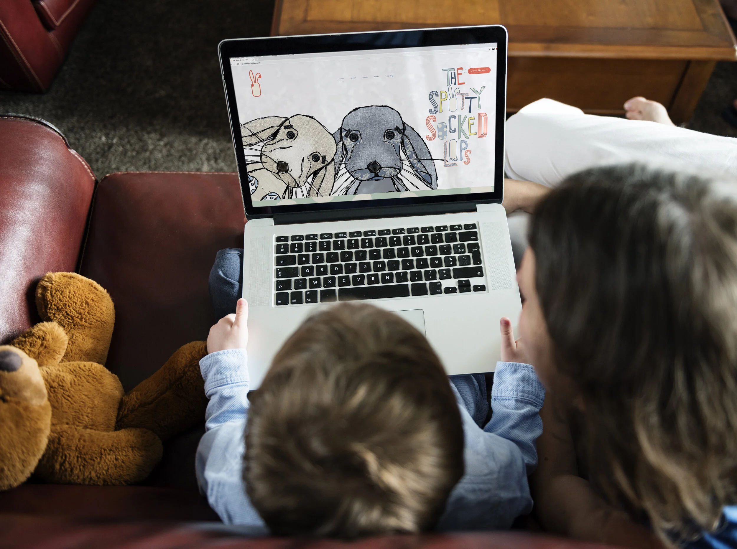
SPOTTYSOCKEDLOPS.COM
The spottysockedlops.com was the website to go along side with book. Within the website there are many different sections which the user can explore. Following the fun, playful design aesthetic within the book, the website features the Little Hoppers section which children can explore cute printable’s, get to know the characters and lots of fun & games.
The website also has a store, selling a range of merchandise including t-shirts, pyjamas and posters. Linked to the website is the books instagram @spottysockedlops which is constantly being updated with cute illustrations and fun activities.

VIRTUAL EXPO
Like everything in 2020, our final expo has had to adapt to fit today’s world, meaning we have had to adapt our work for it to be situated in a virtual show. Though challenging, I really enjoyed piecing all of my work together as one big display to understand the core principles within the design concept.


