
AUTUMN 2020 | A VISUAL SOCIAL MEDIA NARRATIVE REPORT DEPICTING THE JOURNEY OF MY 8 WEEK INTERNSHIP AT KATE & KOLE.
As part of my final year, I was fortunate enough to undertake an internship at boutique jewellery studio Kate & Kole. This opportunity allowed me to explore a completely different side of design alongside the guidance of my mentor Sara Spence. During the 8 weeks, I experimented with jewellery design, 3D rendering and also photography as well learning about nitty gritty side of a bustling business. It was also a chance to work on my blogging skills, researching particular topics and articulating my newly found knowledge into an engaging article pieces for K&K audience. Once I had finished my 8 weeks at Kate & Kole, I had the chance to reflect on my journey through documenting my experience in a report which I focused very much on page layout, rule of thirds and text/ image relationships. Alongside the social media report, I also used After Effects to document my experience through animation.


THE REPORT
I formatted the report in the style of Instagram tiles as a way of acknowledging the importance of a brands social media aesthetic on its audience. Once I had carefully curated and designed the tiles, I displayed my journey on the newly made Instagram account @thekateandkolecollections. This experience gave me the opportunity to learn about the impact of social media on a growing business using engaging social content which remains true to the brand aesthetic. K&K used this brilliant social tactic as a way of introducing their loyal customers to new collections and ranges. I love a beautifully curated Instagram account, which is why I took this opportunity to design a report which would would capture a social media following via its stunning aesthetic though still informing others about my journey. Following a strict colour palette, complimenting fonts and photography guid lines, this report showcased Kate & Koles company beauty whilst remaining informative and engaging with its audience.
The full report can be found
@thekateandkolecollections
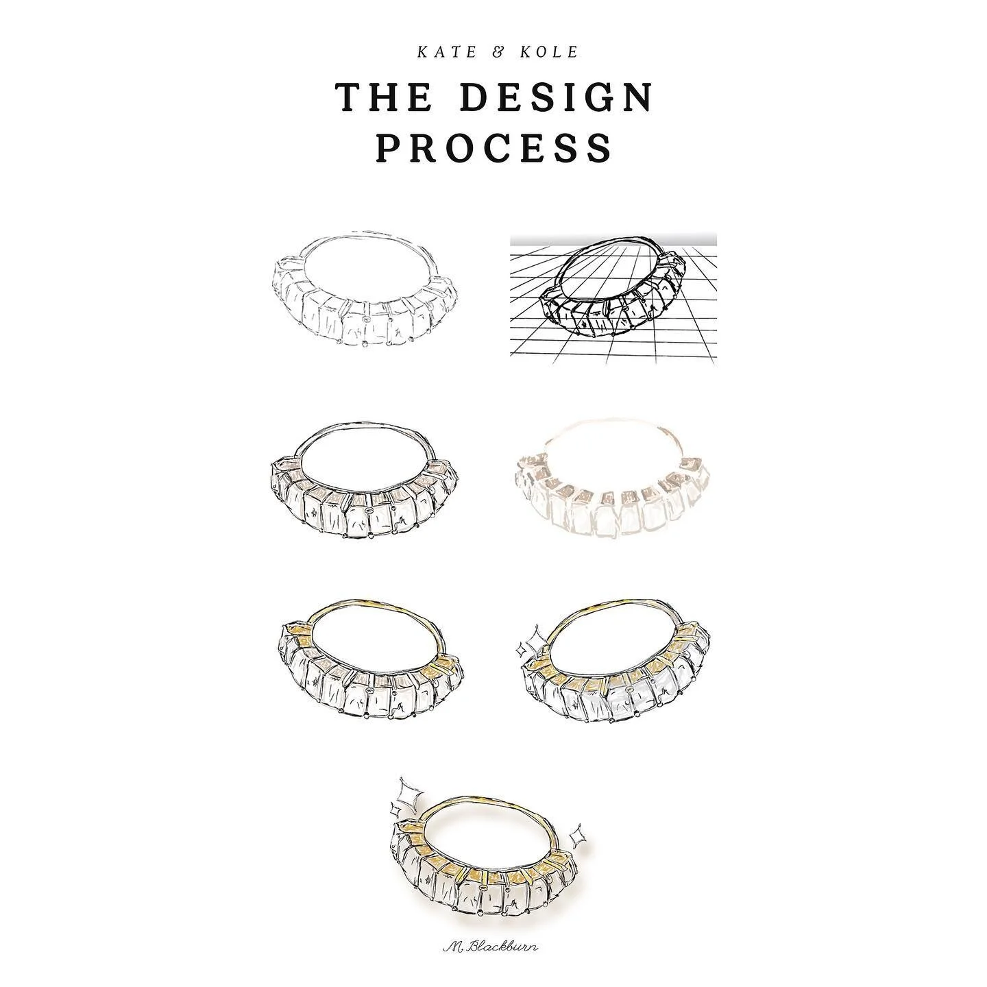


ILLUSTRATIONS
Interning at Kate & Kole was a learning journey as Sara introduced me to different methods of implementing design into industries other than graphics and visuals. I was immediately interested in the process that Kate & Kole use to not only design their pieces but bring their ideas to life. As a way of displaying this beautiful process in a style which can be displayed at their studio following established branding guid lines, I decided to design a series of illustrations which visually depict the beauty of their emerald cut Infinity Ring come to life. This piece was gifted to Sara & Maddy as a way of saying thank you for the opportunity.

DATA ANALYSIS
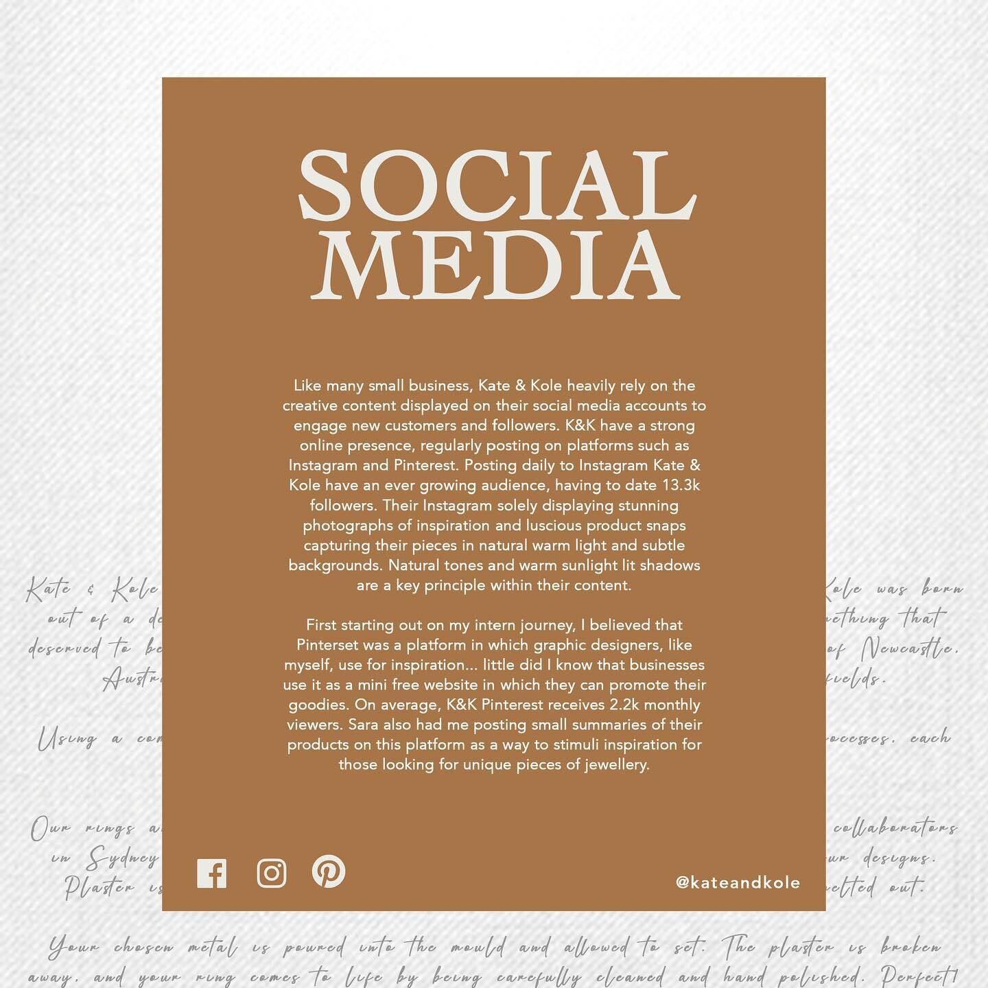
As a growing business, it is important that Kate & Kole analysis their audience demographic on social media. At the end of my internship I was intrigued to see if the company had grown in such a short time frame in which I undertook self data analysis of the businesses social accounts. Looking at audience engagement rates on social media platforms Instagram and Pinterest, gave me an understanding of how many impressions (the total number of times that all the posts have been seen) they have made, engagements (the total number of people who have interacted with the posts) and the demographic overview (age, gender and location).


EXPLORING THE JOURNEY VIA ANIMATION
Alongside a visually engaging report, I also used Adobe After Effects to design an animation following my learning journey. The video required a lot of trial and error, mainly focussing around with different animation styles to successfully portray Kate & Koles brand through motion and sound. Kate & Kole’s brand is beautifully designed through its sheer natural simplicity and I believed this was incredibly important to showcase through the animation. Slow motion transitions, soothing tunes and neutral videography have been used to positively depict the brands aesthetic as well as convey my own experiences.

EXPERIMENTING WITH PAGE LAYOUT FOR SOCIAL MEDIA
Scrolling through Instagram accounts, I found myself being completely drawn to the beauty of consistency within the creative content a company shares. Designing my report, I kept within Kate & Kole’s strict branding guid lines of using subtle neutral tones, regal yet modern typeface and naturally lit photographs. The aim of my report though was to maintain a successful engage with my audience, which is why I focused on changing each tile layout to fit with the flow of my report. This included acknowledging the depth of relevant information needed, understanding the visual and text relationship and also the way the human eye moves over the tiles.


